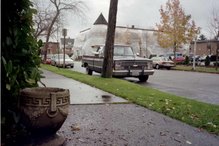
The Hat "n" Boots - "Built in 1947 of concrete and steel, the boots are 24 feet high and 20 feet long. The hat is 22 feet tall with a 45-foot brim of curving concrete on wire and steel". (THE WELL-BUILT ELEPHANT - and other roadside attractions: A Tribute to American Eccentricity, by J.J.C Andrews).
GOOGIE: FIFTIES COFFEE SHOP ARCHITECTURE, by Alan Hess in 1985.
In a column on Monday, April 25, 2011, Kathleen Merryman quotes Melissa McGinnis of Point Defiance Park - "At this point, we are in a compile and assess mode," about the fire at the Pagoda. Merryman adds, "There's a bit of humor and gratitude in the mode. While no one wants a fire in a historic building, this one at least melted the ugly 1960s plastic ceiling lamps. It spared the shovels and rakes in the basement."
The 1960s plastic ceiling lamps can be included in the design space of a book about architecture I have been reading. In Chapter i ("Critics") the author quotes a defender of this kind of design: "Popular taste has become the modern critic's favorite whipping boy," wrote Douglas Haskell in Architectural Forum (August 1958) I quote from GOOGIE: FIFTIES COFFEE SHOP ARCHITECTURE ("Author Alan Hess traces the evolution of these early postwar designs in a lively yet learned essay profusely illutrated..."). Alan Hess explores the topic Why do these buildings look the way they do?
It is a familiar idea carried along by Merryman - that this design space from the 1950s and 1960s is automatically ugly. Somewhere in the actual social importance that people learn to appreciate antiques for beauty and the stories they tell everything 50s and 60s becomes dismissed or easy to dismiss.
One reason why the coffee shops look the way they look is that other alternative energy plans were discarded while the unusual designs created by the alternatives were retained - "Outside, the House of the Future was a cruciform set on a pedestal, a vestige of an early plan to allow the house to rotate to make best use of solar heat in winter." This Monsanto House of the Future (in GOOGIE: FIFTIES COFFEE SHOP ARCHITECTURE Chapter D - '50s Houses) followed through on a design theme (the pedestal) but discarded the purpose - rotation for solar heat.
The coffee shops can seem like mimicry of Futuristic Design. But in other chapters Hess discusses how some of the designs which repeated the shapes of cars used modern structure for practical car-related purpose - recognizable roadway signs are an example, as are wide driveways with overhangs.
One of my aunts and my mother each had an extension-rod lamp with three futuristic light fixtures attached - I was reminded of the lamps after I went to Easter Morning church service in the chapel at
It has been fifty-four years. But, set into each fixture is its answer at last - over fifty years later, the curl of an eco bulb.
The blurb of GOOGIE - "The metal-framed angular designs, employing lavish use of glass, natural (and unnatural) stone, tile, and integrated landscaping became a cachet for the proliferating coffee shops and drive-in restaurants of the 1950s." This was futuristic and some of the futuristic examples were radical.
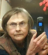
Photo - 2003 Choir Practice - Laura Jensen in white sweater vest.

First Lutheran's Chapel recently smoothly accepted the smaller grand piano that had been in the sanctuary before the church got its present Steinway. So the design proves to handle this recent (2010) change. When we must compare it with GOOGIE because the design elements are the same, we need to remember that the style of architecture sprang from the Futuristic mode. When I notice this I see that the GOOGIE's California Coffee Shops' radical overemphasis defines the design trend, makes it recognizable by exaggeration and everyday repetition.
GOOGIE: FIFTIES COFFEE SHOP ARCHITECTURE, by Alan Hess in 1985.


